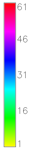
Travel time in minutes to Park Street assuming 3 mph walk as the crow flies and no waiting time
Travel time in minutes to Park Street assuming 3 mph walk as the crow flies and no waiting time
The map above shows the transit time from points within approximately 1.5 miles from a Red line stop to park street station, assuming a 3mph walking pace (as the crow flies) and no waiting time at the station. That's pretty simplistic, and I hope to address that in a future full system version. The map zooms to view the data more closely.
When time permits, I hope to create a more sophisticated model incorporating all the subway and bus lines with a cost model that incorporates wait times (likely half the headway for a given time of day). The result should be interesting to see any underserved communities in the MBTA system.
A transit system is a series of nodes (stations) connected by edges (rail/bus lines). The cost of transiting the edges between stations is simply the time it takes the train to get between stations.
In order to model the time through the system from points in the area around a station, I added a regular grid of "test" nodes, each with an edge to any station within 1.5 miles. The cost of each of those edges is the time it takes to walk the length from the test node to the station at the given walking speed.
Dijkstra's algorithm efficiently computes the lowest cost paths through the network to every node from a given start node. In this case, the cost of transit from any of the walking nodes to the start location is the time to ride the train to a close by station, then walk from that station to the walking test node. Just run the algorithm, then iterate through all the test nodes on the regular grid and ask for the cost to the designated start node and output the cost.
Neo4j, being a graph database, was a natural fit for this problem, especially since they supply an implementation of Dijkstra's algorithm. With a handy JRuby wrapper, it was simple to build the model, and stunningly fast to get the point by point transit costs calculated.
By day, James Kebinger is a Senior Developer at PatientsLikeMe.
The ruby code behind the visualization is available on github at http://github.com/jkebinger/transit-system-neo4j-example
I couldn't have done this project without numerous open source projects